

Debugging AI solutions is often very challenging yet necessary to create successful results. With millions of data values, impacted by tiny data changes, feeding into training cycles that can last days and weeks, it is a daunting task to figure out why the model blows up or is not learning at all.
To help with the debugging process we use a simple debugging check-list that focuses our efforts on what may be the cause of a learning problem within an AI solution. This check-list comprises the following steps:
- Check the Data – is the data different between labels, is it learnable?
- Check the Weights – are the pre-loaded weights correct?
- Check the Timings – where are the bottlenecks in the training/inference process?
- Check the Gradients – during training, are the gradients out of range?
- Understand the Results – when we get results, what do they actually mean?
Step 1 – Check the Data
There are many ways to check the data to verify its learnability. At the top of our list is the TSNE [1] algorithm. TSNE produces a visual representation of the data separation between labels.
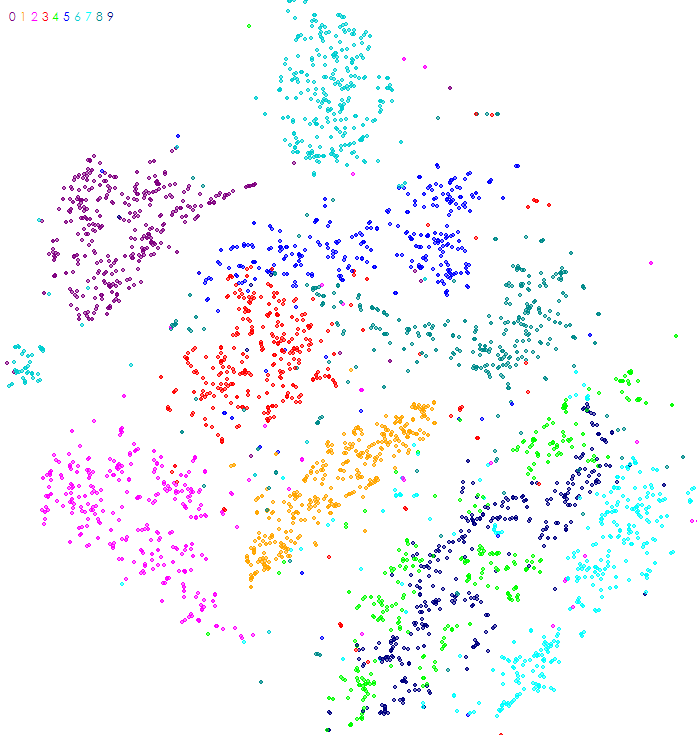
Each dot in the image produced by TSNE represents a data point within the dataset, where the color of the dot is associated with the label of the data point. For example, the image above is the TSNE analysis of the MNIST [2] dataset of hand written characters when each dot represents a different hand written character image (e.g. all hand written ‘0’ characters are dark purple and located in the upper left corner of the image).
Using this method, one can quickly visually see whether or not the data is separable where higher data separations are easier to learn. The TSNE of the MNIST dataset shows that the dataset has data points that are highly separable across labels as the groupings of each label are easy to visually see. This separation also indicates the learnability of the dataset – the MNIST dataset for example is very easy to learn using deep learning techniques. However, difficult data sets do not often show a clear data separation in the TSNE algorithm. With these difficult datasets we must use more detailed analysis such as comparing the number ranges for pixel values within the mean image created for each label.
Step 2 – Check the Weights
Weights make up the stored knowledge learned during the model training. One technique used to speed up learning involves ‘transfer learning’ where the weights learned over many iterations for one solution are imported and used as the starting point for the training of another solution. However, during this process it is important to verify that the starting weights are actually imported correctly and set the starting point as expected.
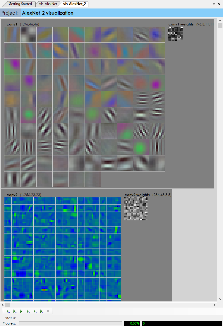
A visual inspection of the weights can quickly verify that the starting weights are loaded correctly.
Step 3 Check the Timings
Training an AI solution often takes a lot of time – sometimes days if not weeks of training are used to converge on a solution. For this reason, timing matters – but when a model has over one hundred layers finding bottlenecks is difficult. Enabling The SignalPop AI Designer debug window during training shows not only the value ranges produced at each layer but also the timing for both the forward and backward passes, which allows for quick pinpointing of bottlenecks in the training process.
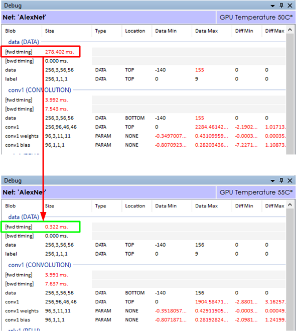
The above timings show the difference between running a model with two different image loading methods. In the top timing, the data (DATA) layer took 278.402 milliseconds to load the images into the batch of data then passed to the next convolution layer.
This model used the LOAD_ON_DEMAND_NOCACHE image loading method which directly loads each image from disk as it fills out the batch of data. By changing the loading method to the LOAD_ALL, all images are first loaded into memory before used in training. As can be seen this loading method dramatically improved the data load time from 278 milliseconds to 0.322 milliseconds. When running thousands of cycles such timing changes add up substantially. For example, when training over 500,000 iterations, this small change alone saves over 38 hours of training time.
Step 4 – Check the Gradients
Gradients are the small changes calculated during each backward pass through the model, and then applied to the weights based on the learning rate and optimization method used, such as SGD, ADAM, or RMSPROP. According to [3], the learning rate may be one of the most important hyper-parameters of the model. The learning rate controls how much of each gradient is applied to the weights after each backward pass. And, ideally for balanced learning, the gradients should fall within numeric ranges well under the overall numeric ranges of the weights for which they are applied. However, when learning rates are too high or the learning becomes out of balanced, the gradients applied may exceed the numeric ranges of the weights causing erratic learning. Alternatively, when error values become small a vanishing gradient [4] may occur which can stall learning. Model architecture combined with a training strategy that balances the learning rate, clipped gradient levels and loss weight changes can determine whether the model explodes to infinity (or NaN), develops a vanishing gradient, or remains in balance and learns as expected. Maintaining this balance forms the training strategy used, and is the essence of the ‘art’ side of AI.
We use two techniques to determine what the gradients are doing during training.
First, we use the Debug Window of The SignalPop AI Designer to look at the range of ‘diff’ values flowing through the network on each pass and pay particular attention to the backward pass through the first convolution layer (which is the last to receive the gradients calculated through the entire network).
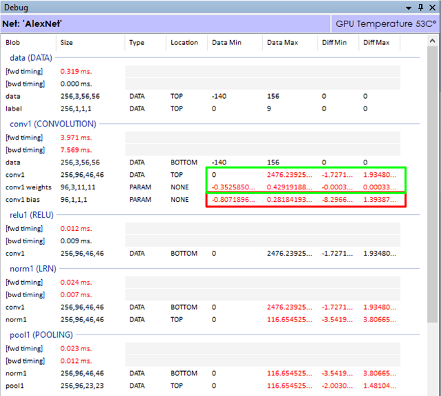
If the gradients in the first convolution layer are not within the numeric ranges of its weights (or bias) values, the layer may not learn optimally. As shown above, the gradient (diff) value ranges are well below the data ranges for both the conv1 and conv1 weights, but appear to be well out of range for the conv1 bias values. This situation indicates that we may want to alter the amount gradient applied to the bias on each backward pass.
If the diff values are off in both the bias and weights the dropping the reducing the learning rate, reducing the gradient clipping value, or changing the learning rate multiplier specified for the given layer may help bring the learning more into balance. During the fine-tuning of a network where error values tend to get small, increasing the loss weight may help move the gradients into a larger number range where their impact has more effect.
Step 5 – Understand the Results
On the surface, the results produced by the general classification model are the predicted label itself. For example when detecting an image within CIFAR-10 [5] the predicted label will be one of the following: airplane, automobile, bird, cat, deer, dog, frog, horse, ship or truck. However, understanding why each label fires can provide much more meaningful insights into the dataset used to learn the solution.
There are several techniques used to determine the ‘impact’ of the model on each label. In the first example, we run a label impact analysis to determine which areas of a given image trigger the detected label. This process uses an algorithm inspired by [6] where the network is run repeatedly on the same image with a small moving window blocking out a portion of the image to see which areas of the image have a higher impact on the network end result.
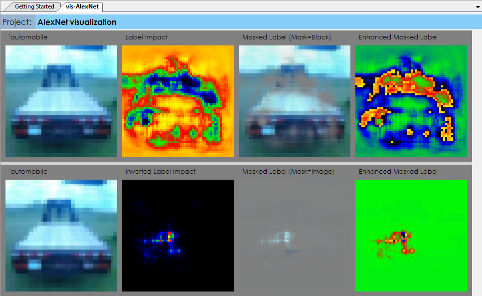
In the first row of the label impact visualization, on each run a portion of the image is blocked out with a small window of all black pixels that are then moved to different parts of the image on each run until all areas of the image have been tested. In the second row, the opposite approach is taken, where the base-line image is colored in all black pixels and only the small window contains the original pixels from the original image.
In the second technique, we run repeated runs on the image mean of the dataset where on each run a small image window is highlighted in the image and the set of results are used to determine which label the image window most strongly contributes to. This method shows the relative strength of each area within the input image in relation to each label.
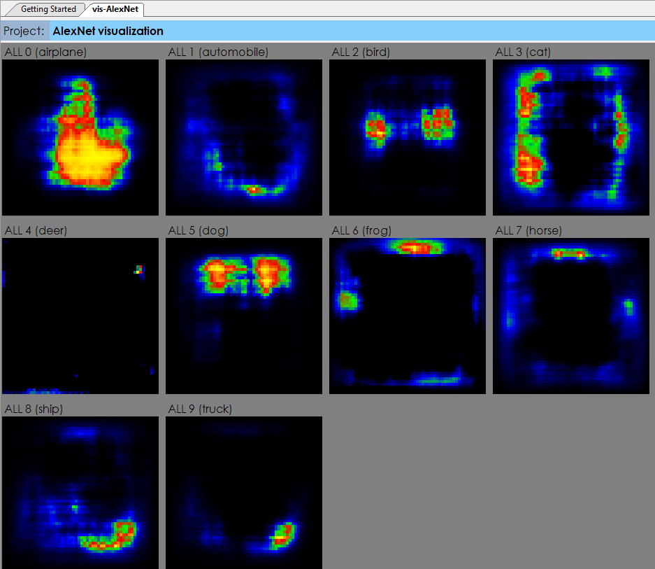
These analysis can be especially helpful when each pixel corresponds to a specific value instead of just a dot within a picture. For example, running such analysis on a heat-map of data can show which items within the heat-map contributed more to one label vs another.
To learn more about debugging your AI models see the Getting Started document or try it out with The SignalPop AI Designer.
[1] Laurens van der Maaten and Geoffrey Hinton, Visualizing Data using t-SNE, 2008, Journal of Machine Learning Research, Issue 9.
[2] Yann LeCun, Corinna Cortes and Christopher J. C. Burges, The MNIST Dataset of handwritten digits.
[3] Jason Brownlee, Understand the Impact of Learning Rate on Neural Network Performance, 2019, Machine Learning Mastery.
[4] Chi-Feng Wang, The Vanishing Gradient Problem, 2019, Towards Data Science.
[5] Alex Krizhevsky, The CIFAR-10 dataset.
[6] Matthew D. Zeiler and Rob Fergus, Visualizing and Understanding Convolutional Networks, 2013, arXiv:1311.2901.